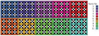
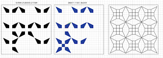
Another design that was created by hand that I wanted to develop digitally. It uses the idea that the number of 'numberletters' is indicated by how much of the pattern is coloured in. The completed pattern can be seen on the right and examples of the the idea being used can be seen on the left.
I tried using colour on the middle one, but the original pattern idea was to create it in black and white - which I prefer to the blue pattern. To keep the pattern black and white a colour code was created for the background. The colour selected would be based on what your name number is.
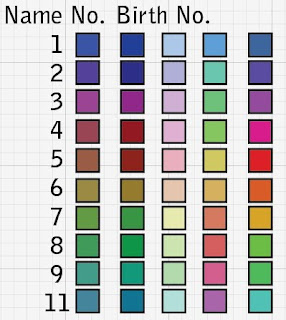
The example above shows a completed pattern with the 10 different backgrounds that you could have. I considered the possibility of using a persons birth number as well/instead of the name number for the colours - this is something that could be explored further. Below are the other colour options that were considered before the final selection was picked.
To demonstrate this set of rules being used a couple of energy patterns have created using names with different name numbers. I think the boldness of the colours are effective and that this is a good way of keeping the black and white pattern.
Tuesday, 28 December 2010
Sunday, 26 December 2010
Cubes
From the pattern design ideas that I created by hand I selected three to develop further digitally. The first to be explored was the cube idea - this involved three cubes that would be coloured in depending on the number of numberletters within a name. Two options were researched-
1. All that is shown are the segmants that are coloured.
2. The segmants that are coloured are shown and the outlines of the empty pieces.
Aesthetically both options have interesting outcomes - the question is which is better? Showing what could be filled in or having which space?
A little bit more development - on the right I have changed the normal nine square grid that is usually used and instead put it into the cubes - then using a colour code (seen in the top right corner) to indicate the number of 'letternumbers' there is.
Lines
I took a break from creating images digitally and sat down and just sketched/created/brain stormed for other ideas of how to take the energy diagrams further - this can all be seen in my sketchbook.
One of the first things that can to mind was to use just lines - this was partly based on the work I did last year - to create a typeface using one shape and a set of rules. With this idea in mind a set of rules were created that represented the number of numberletters within a name. Using the same set up as the original energy diagrams I went about creating the examples that can be seen above.
The outcomes had a powerful and individual look about them, which I liked. To continue the development more examples were created (see below) and then to take them a step further the grid boxes were removed so that all that left was the lines. Also, the colours were changed and a few brush strokes were used.
The change of brush strokes were done to show a few more options and that the regemented straight lines could be changed to give a different look. I would say that the bottom right example looks similar to sand paintings.
Pattern Experiments
Having explored the original idea of creating an energy diagram I wanted to take it further and make it more pleasing to the eye. To start with I looked at using a die/dominoes style using dots.
I think this is a bit obvious and quite boring to look at as it's something you would expect and not particularly challenging in any way.
Using dots as a starting point I then went on to look at overlapping the shapes.
To do this effectively I decided to change the colours of the seperate shapes - mainly so that you can tell the difference between each circle. I was inspired by Philip K Dick book covers that use layering of circles to create images:
The examples above haven't taken this idea to the same place as the bookcover. However, it is something that I could explore further.
Friday, 24 December 2010
More playing around
Again looking at the circle patterns I wanted to look at encorporating the name into the design.
To start with I simply placed the text in the bottom corner. The typeface that had been used before didn't look right so I changed it to a more digital looking one - One that is typically used on things like credit/debit cards. The next step was to look at the colour of the text - the black was a bit too bold when compared to the pink.
I looked at three colour choices - black, the same colour as the circles (in this case pink) and a darker shade of the circle colour. Keeping in mind the issue that was raised in an earlier post - the idea of what if two or more people had the same name - I changed the colours to create two options - blue and pink to see how the text colour would be affected.
A very brief mock up of a potential ID card - something I have been exploring in my sketchbook.
Further development of Circles
To continue the development of the circle patterns - I've looked at what other shapes could be used. They all look interesting, but I do prefer the circle for the smoothness - also, I think that it shows the idea of energy well. However, I do love the optical illusion that was created with the middle triangle - this could be good with the circles. Also, I've looked at colouring the circles - in the left hand one I've looked at the idea of using different colours depending on their place.
I felt that it was important to test the other shapes before completely dismissing them - in this case I have used hexagons. The main issue I found with using them is that they are much harder to line up with the numbers.
Next I went back to just using one colour and thicker lines and simply created several patterns to be able to view and analyse the finished outcome for a variety of names. I think they do show that there is a kind of 'fingerprint' that is created from the individuals name.
Energy Diagrams Development
I started by creating a few energy diagrams like the ones from 'Numerology' by Norman Shine.
The diagrams work by indicating the number of numbers within the persons name by circling the number. For example in the left diagram there's one 8 in the name so only one circle is placed around the 8. This looks interesting, but I'm sure there is much more that can be done with it.
To begin with I simply took away the numbers so that all that is left are the circle patterns. Doing this kind of diagram creates a 'finger print' for the person using their name and could potentially be used in some form of identification.
Going on the idea of identification I thought of a potential problem - if two or more people have the same name then they would have identical patterns. To get around this potential problem I thought that distinctions could be made using colour and/or the thickness of the lines of the circles. In the left example above I've looked at using different colours - the colours were selected from a swatch option in Illustrator. In the right example I have looked at thickening the lines and using completely different colours.
With both I think there is some improvement - personally I prefer the right one for the thickness of the lines, but the left one for the colour choice.
iphone apps
I decided to explore the idea of creating an iphone app for Numerology. Having sketched a few ideas I then went on to explore what was already out there.
I found that there are around 100 apps that in some way are connected to Numerology. Some were serious, others were novelty apps - like the Love Calculator that you can get on your mobile that don't really mean anything. Others were based on the Eastern version of numerology whereas I am souly looking at western numerology.
All in all there were a lot, but I had a look at a few of the more 'serious' looking ones to see what they offered.
This is 'Numerology' the first app that came up on my search. What it offers can be seen on the left screen shot. It doesn't seem to offer much in the way of an explaination for its findings - also, I find the design quite boring in appearance, which given that you have to pay £3.49 for the full package seems a bit of a shame.
This one is called 'Astro Numerology' and whilst it does give a slightly more detailed responce. I feel that the design has a 'gimmick' look. The background is very similar to the Matrix designs, the font for the name is tacky. The spinning wheel is a good idea, but can be a pain when scrolling - I don't have it so I can't say if it would be too fast. However, with the i-selection of products I tend to find the scrolling options go too fast.
This is from an app called 'Vedic Numerology' - It has a much more interesting appearance then the others using this world background. Also, it uses the scroll box, which is identical to the one used in 'Astro Numerology'. I presume that this is to do with it being for Apple and that there is a certain template that you are meant to stick to. This one offers you a bigger 'profile' from your name and birth date then the others.
The last example I've looked at is from an app called 'Free Numerology Reading' - It's very basic in comparision with the other ones that I've looked - giving only the name number and basic keywords of what it means. The design has a more individual look then the others using textured backgrounds and 'fancy' typefaces. However, I feel that the design has far to much going on when you look at it and that the dark background takes away from the white text.
Energy Diagrams
In one of the books I read for this topic - Numerology by Norman Shine - It talks about being able to see what kinds of energy an individual possesses. To do this you create an energy diagram you use a grid numbered 1 to 9 (as seen below).
You then indicate how many numbers are in the persons name - in the case of Shines book he uses circles.
Energy lines can be formed to show particular strengths and weaknesses in a person depending on the energy flow within their name. The strongest number on the line is indicated by the arrow. The lines created have different meanings depending on the line - there's the physical body line, the intellectual line, etc..
I think this is an interesting thing to explore - however, it is a very big topic which is difficult to explain and possibly too big for the time that I have been given to use it in full. Although, I will be using and exploring the circle patterns - mostly because of the asthetics of the energy diagrams and the potential they have of being used to create an interesting piece. However, I still don't know what that would be.
Starting point
I felt that to be able to start at all I should first collect a list of people, their numbers and what they think of themselves - just to see whether it works. Also, I would then have information to use if I wanted further on in the project.
So to begin with I created this short questionnaire:
What is your full birth name as written on your birth certificate? (include middle names) Have you changed your name? If so what to? What is your date of birth? How would you describe yourself? (select from below – might be worth deleting the ones that don’t apply to you) Positives: independent, creative, original, ambitious, determined, self-assured, diplomatic, warm, peaceful, sensitive, sociable, friendly, trustworthy, helpful, steady, logical, adaptable, freedom-loving, romantic compassionate, stable, unusual, accomplished, organized, emotional, tolerant, active, idealistic, wise, intense, idealistic, resourceful Negatives: arrogant, stubborn, impatient, too dependent, manipulative, extravagant, scattered, superficial, contrary, stubborn, narrow, irresponsible, inconsistent, superficial, jealous, possessive, melancholic, odd, tense, narrow, materialistic, moody, bullying, overly emotional, sullen, restless, over-sensitive, manipulative, destructive
I promised confidentiality so that the people I contacted would feel that they could be honest. When displaying the information that has been collected I will refer to them only as the numbers that their names relate to. For example - Sarah is 11918.
The information that I recieved was interesting with quite a few people matching what they thought of themselves to what numerology says they should be like.
The problem I have now is that I'm not sure yet what to do with this information.
Monday, 13 December 2010
Numerology
For the Hidden project I have looked in the idea of fortune telling. The majority of my research has been done using books as I have found that internet research tends to just throw up sites that tell your fortune rather then offer any of the history or real information.
Reading list:
Runes:
Thorsons Way of - The Runes by Bernard King
Complete Illustrated Guide - Runes: How to Interpret the Ancient System of the Runes by Nigel Pennick
Numerology:
Simple Numerology: A Simple Wisdom Book by Damian Sharp
Numerology: Your Character and Future Revealed in Numbers by Norman M Shine
Tarot:
Dragon Tarot Deck - by Terry Donaldson and Peter Pracownik
Having explored what these topics have to offer I found that Numerology gives the most. Out of all the different types of fortune telling I have looked at it is the oldest and has its roots in many cultures. Also, the fact that it has its roots in science and philosophy, even if now it is a 'pseudo science', to me makes it more creditable. It also, gives me the opportunity to bring together my love of numbers and design in an interesting way.
Subscribe to:
Posts (Atom)