Sunday, 9 January 2011

Influences

As I was creating the patterns that have been featured in my sketchbook and in previous posts I thought about were the inspiration comes from. I've always loved patterns and have been drawing them for years in the back of my school note books. Also, my parents used to buy me pattern colouring books when I was younger simular to the example given below.
Later influences came from geometric design which is something most people would first be exposed to in maths when you learn about shapes and tessellation. These patterns are very pleasing to the eye. Also, from Islamic Art which uses patterns instead of imagery.
The most resent piece of design that contributes to my influences is the art of Blackwork - used in embroidery.
I've used blackwork before to create images through sewing (see above)

Saturday, 8 January 2011

Numbers

Stepping away from patterns for a moment I wanted to address the issue of the numbers themselves. In doing research by looking through magazines, newspapers and books I found that numbers tend to be left alone in a boring typeface whilst text has a much bigger range of choice to look at. One place were I found numbers being displayed in a more interesting manor was in the Joe Brown catalogue - which I've spoken about in my sketchbook.

I wanted to show the variety of ways that numbers can be displayed - so I went through all the typefaces that are on my computer and came up with this sheet -
The page is overwhelming to look at, but it's just to demonstrate the variety. This is something I could consider exploring further if I think that the patterns are not the way to go.

Another Pattern

One last pattern that I chose to develop digitally - it works much in the same way as the previous one and I would probably use the same ideas with it. To keep it black and white with a colour code would be used as the background.

Tuesday, 28 December 2010

Patterns

Another design that was created by hand that I wanted to develop digitally. It uses the idea that the number of 'numberletters' is indicated by how much of the pattern is coloured in. The completed pattern can be seen on the right and examples of the the idea being used can be seen on the left.
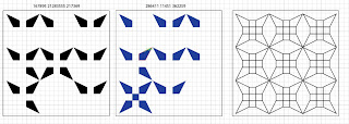
I tried using colour on the middle one, but the original pattern idea was to create it in black and white - which I prefer to the blue pattern. To keep the pattern black and white a colour code was created for the background. The colour selected would be based on what your name number is.
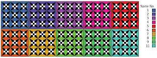
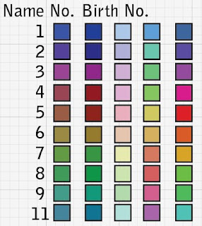
The example above shows a completed pattern with the 10 different backgrounds that you could have. I considered the possibility of using a persons birth number as well/instead of the name number for the colours - this is something that could be explored further. Below are the other colour options that were considered before the final selection was picked.
To demonstrate this set of rules being used a couple of energy patterns have created using names with different name numbers. I think the boldness of the colours are effective and that this is a good way of keeping the black and white pattern.

Sunday, 26 December 2010

Cubes

From the pattern design ideas that I created by hand I selected three to develop further digitally. The first to be explored was the cube idea - this involved three cubes that would be coloured in depending on the number of numberletters within a name. Two options were researched-
1. All that is shown are the segmants that are coloured.
2. The segmants that are coloured are shown and the outlines of the empty pieces.
Aesthetically both options have interesting outcomes - the question is which is better? Showing what could be filled in or having which space?
A little bit more development - on the right I have changed the normal nine square grid that is usually used and instead put it into the cubes - then using a colour code (seen in the top right corner) to indicate the number of 'letternumbers' there is.

Lines


I took a break from creating images digitally and sat down and just sketched/created/brain stormed for other ideas of how to take the energy diagrams further - this can all be seen in my sketchbook.

One of the first things that can to mind was to use just lines - this was partly based on the work I did last year - to create a typeface using one shape and a set of rules. With this idea in mind a set of rules were created that represented the number of numberletters within a name. Using the same set up as the original energy diagrams I went about creating the examples that can be seen above.

The outcomes had a powerful and individual look about them, which I liked. To continue the development more examples were created (see below) and then to take them a step further the grid boxes were removed so that all that left was the lines. Also, the colours were changed and a few brush strokes were used.

The change of brush strokes were done to show a few more options and that the regemented straight lines could be changed to give a different look. I would say that the bottom right example looks similar to sand paintings.

Pattern Experiments

Having explored the original idea of creating an energy diagram I wanted to take it further and make it more pleasing to the eye. To start with I looked at using a die/dominoes style using dots.
I think this is a bit obvious and quite boring to look at as it's something you would expect and not particularly challenging in any way.
Using dots as a starting point I then went on to look at overlapping the shapes.
To do this effectively I decided to change the colours of the seperate shapes - mainly so that you can tell the difference between each circle. I was inspired by Philip K Dick book covers that use layering of circles to create images:
The examples above haven't taken this idea to the same place as the bookcover. However, it is something that I could explore further.